Apple Says No Fun Allowed On the Touch Bar
10/28/2016
7064
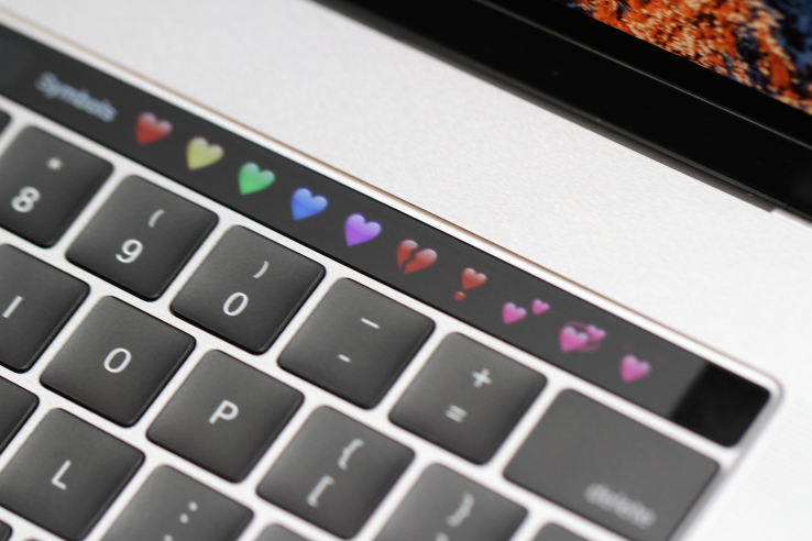
The Touch Bar is serious business. Apple’s interface guidelines warn against all kinds of fun things that developers probably started thinking about when the new MacBook Pros leaked earlier this week. No doubt some apps will find a way to be creative even under the stern eye of Apple’s party police, but it’s clearly discouraged.
Here are a few choice items from Apple’s guidelines telling developers how to create Touch Bar interfaces:
Use the Touch Bar as an extension of the keyboard and trackpad, not as a display.
The Touch Bar shouldn’t display alerts, messages, scrolling content, static content, or anything else that commands the user’s attention or distracts from their work on the main screen.
Avoid animation. The Touch Bar is considered an extension of the keyboard, and people don’t expect animation in their keyboard.
Use color tastefully and minimally. In general, the Touch Bar should be similar in appearance to the physical keyboard.
In general, the Touch Bar shouldn’t include controls for tasks such as find, select all, deselect, copy, cut, paste, undo, redo, new, save, close, print, and quit.
Now, admittedly, some of these things could be annoying or pulled off poorly. And it’s clear that Apple wants developers and users both to think of the Touch Bar as an extension of the keyboard, not of the screen. But prescribing usage in that way often isn’t a good idea. The fact is it’s both, and ought to be used for both.
Who wouldn’t want a stock ticker there, or a Twitter feed, or a progress bar for downloads and file operations? There are plenty of possibilities to explore here, and it seems a disservice to insist that things remain monochrome, key-shaped and static.

Even if we’re going to keep things boring, why not have copy, paste, save and all those on there? Sure, they duplicate shortcut keys, but so do a bunch of the things they showed onstage today.
Standardizing stuff so users know more or less what to expect is a good idea, especially with a new feature like this, but this is more stifling than standardizing. Experimentation with novel user interfaces has created all kinds of fun apps with intuitive and interesting controls. Apple is pretending it already knows everything about how this interface should be used, when it’s actually a wide open field.
Whether any of this matters depends a lot on how rigorously Apple enforces these design guidelines. Will it be satisfied with simply encouraging its own limited vision of what should appear on the Touch Bar, or will it actively discourage apps that step outside it? We’ll know soon. But it would be a shame to see this cool new feature fall short of its potential.
Soure from TechCrunch
