 NEWS
NEWS
iOS 27 Redesigns Apple Pay Checkout With Easier Card Switching
 09/28/2026
 126
126
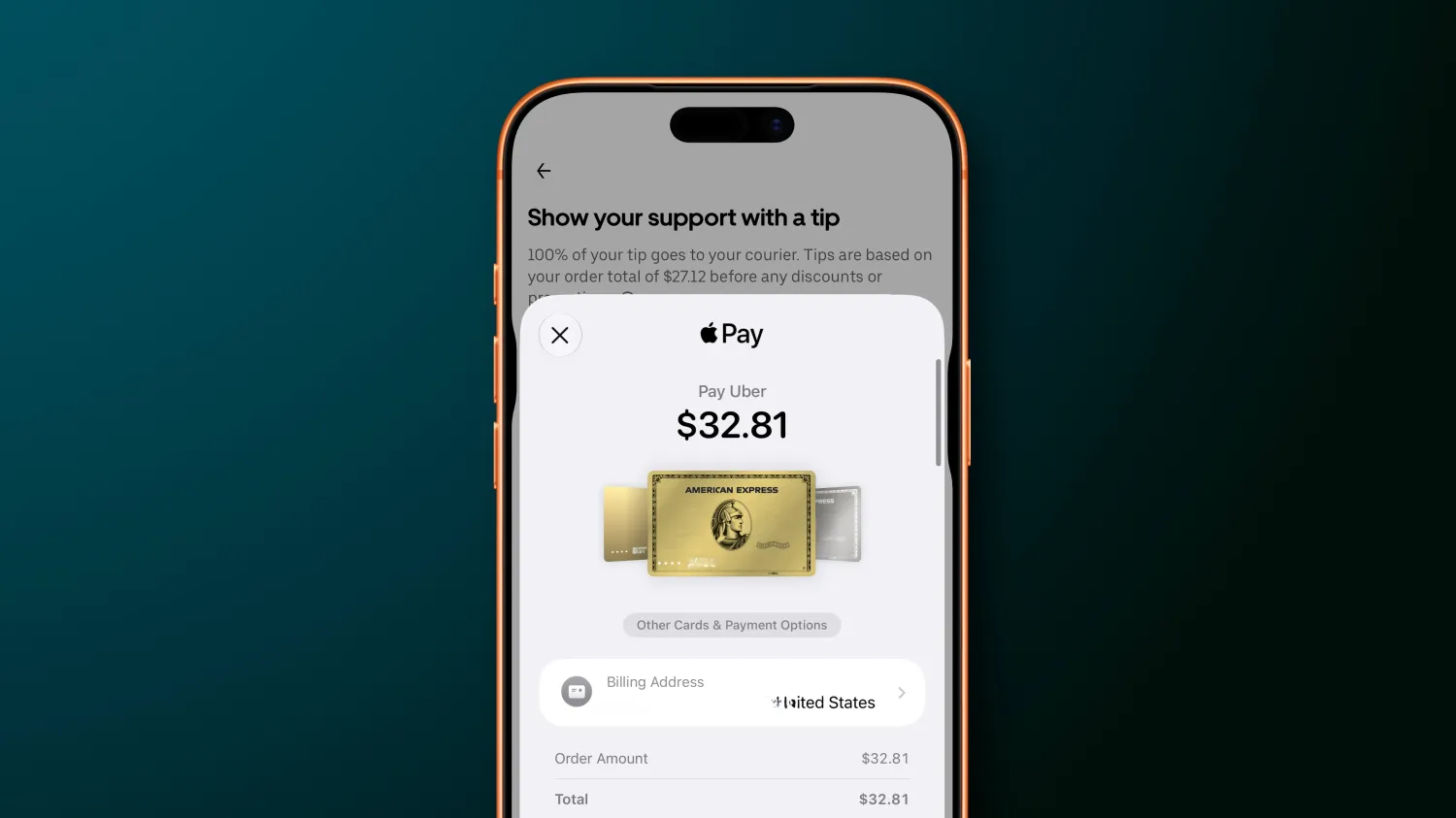
Apple has redesigned the Apple Pay checkout experience in iOS 27, making it easier for users to switch between payment cards and review important order and payment information.
The updated interface is available when using Apple Pay in supported apps and websites, replacing several confusing elements of the previous checkout experience with a more straightforward card-selection system.
Swipe Between Apple Pay Cards
One of the biggest changes in iOS 27 is the ability to swipe between payment cards directly from the main Apple Pay interface.
Instead of navigating through a separate menu, users can simply swipe to select another card during checkout.
Users can also tap the current card to open a grid-style view showing all available Apple Pay cards in one place.
This makes it easier to quickly find and select the card they want to use.
More Payment Information at Checkout
Apple is also making more relevant information available directly within the Apple Pay payment sheet.
Depending on the card and merchant, users may be able to see details such as:
●Card rewards
●Available balances
●Debit account balances
●Pay Later options
●Other eligible card information
The goal is to help users make more informed decisions about which payment method to use before completing a purchase.
Developers Control the Information Displayed
The exact information shown in the Apple Pay payment sheet can vary depending on the merchant and app.
Apple gives developers and merchants control over which information appears, based on what is required to complete the transaction.
This means users may see different payment details depending on the card, merchant, and checkout experience.
iOS 27 Fixes a Confusing iOS 26 Experience
The redesign also addresses several usability issues with the Apple Pay interface in iOS 26.
Previously, switching cards could be confusing because tapping the displayed card didn't actually open the card-selection interface. Instead, it could take users to an address-editing screen.
To switch cards, users had to find a separate button at the bottom of the payment sheet.
In iOS 27, Apple has made the interaction much more intuitive. Users can simply swipe through cards or tap the card to access the full card grid.
A More Straightforward Apple Pay Experience
The Apple Pay redesign in iOS 27 is relatively small compared with Apple's larger system updates, but it improves an important everyday interaction.
By putting card switching directly into the main checkout interface and surfacing more relevant payment information, Apple is making Apple Pay easier to understand and faster to use.
For users who regularly keep multiple cards in Apple Wallet, the new design should make choosing the right payment method during checkout considerably more straightforward.
Source: 9to5mac