iOS 12 Adds New Graphs to Show Your Battery Level Changed Throughout the Day
06/07/2018
2480
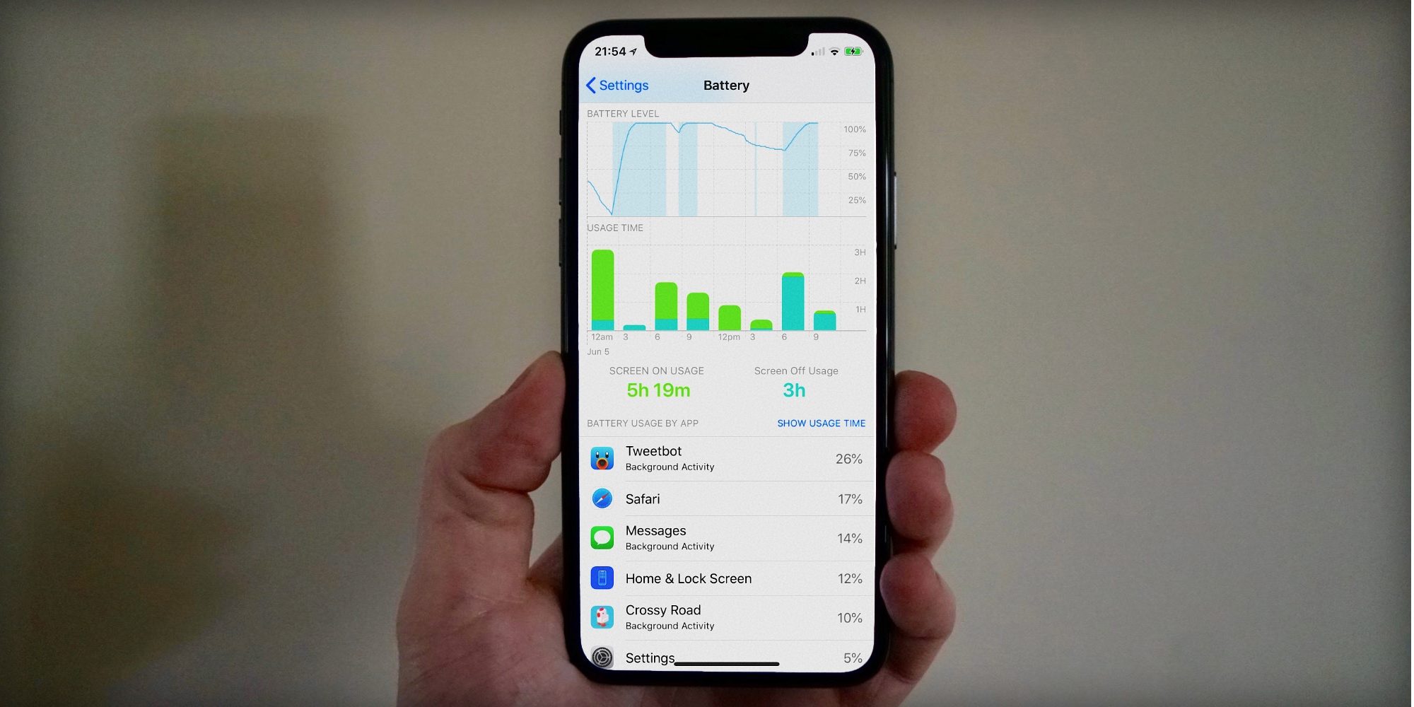
iOS 12 doesn’t change the Battery Health screen that was the answer to the performance throttling furore of late 2017, a screen that is still marked as ‘Beta’ even on iOS 12, but it does bring some new detailed charts to the main Battery view. As well as screen on and standby usage, you can now see how quickly the battery level depleted during the day. The charts are interactive so you can drill down further …
To access the new Battery stats, just go to Settings -> Battery. Above the breakdown of app usage, you can see two new charts in iOS 12. The first is called Battery Level, and plots battery % over time. At the top, you can switch between seeing data for the last 24 hours or the last ten days.
For the first time ever, this linw chart lets you identify where your battery dropped the quickest. Obviously, a steeper section of the line is where something you were doing was particularly draining on battery life. You can tap on the graph and focus on the corresponding time period under your finger.
The app list below is filtered to only show app usage from within that slice of time. The numeric ‘screen on’ and ‘screen off’ summaries below the graphs also update to reflect the selected time window. The graph is subtly shaded to indicate times when iPhone was plugged in and charging.

The ‘Usage Time’ bar chart is a visual representation of screen off and screen on time, with each bar color-coded into light green (representing screen on) and turquoise segments (screen off). Like the battery level graph, you can tap on bars to focus on a subset of the data.
On either chart, if you have selected a time window, tap it again to remove the selection and show stats for the entire period. These stats will surely come in handy if you start noticing your iPhone battery drained particularly quickly one day, and you can easily see that it was caused by playing a 3D game for an hour, or whatever.
Unfortunately, these new graphs feel a bit rough and ready in iOS 12 beta 1. There are no smooth animations or even an indicator that the graphs are selectable until you tap and release. It would be nice if they acted more like graphs in the Stocks app, where you can long press and see a numeric readout for the data point underneath your finger.
Source: 9to5mac


