 2436
2436
 2018-07-12
One of the most significant design opportunities in recent history was announced with a simple blog post on Apple's website. “Let me just say it: We want native third-party applications on the iPhone, and we plan to have an SDK in developers’ hands in February,” Steve Jobs wrote. On a quiet Thursday morning less than a year later, the App Store opened to iPhone users with a selection of just over 500 apps.
Few contemporary innovations have changed how we live our lives and interact with the world around us more than iPhone apps. The creators of the first 500 available at launch had the unique opportunity of shaping the design direction and interaction methods of the millions of apps created since.

The Apps
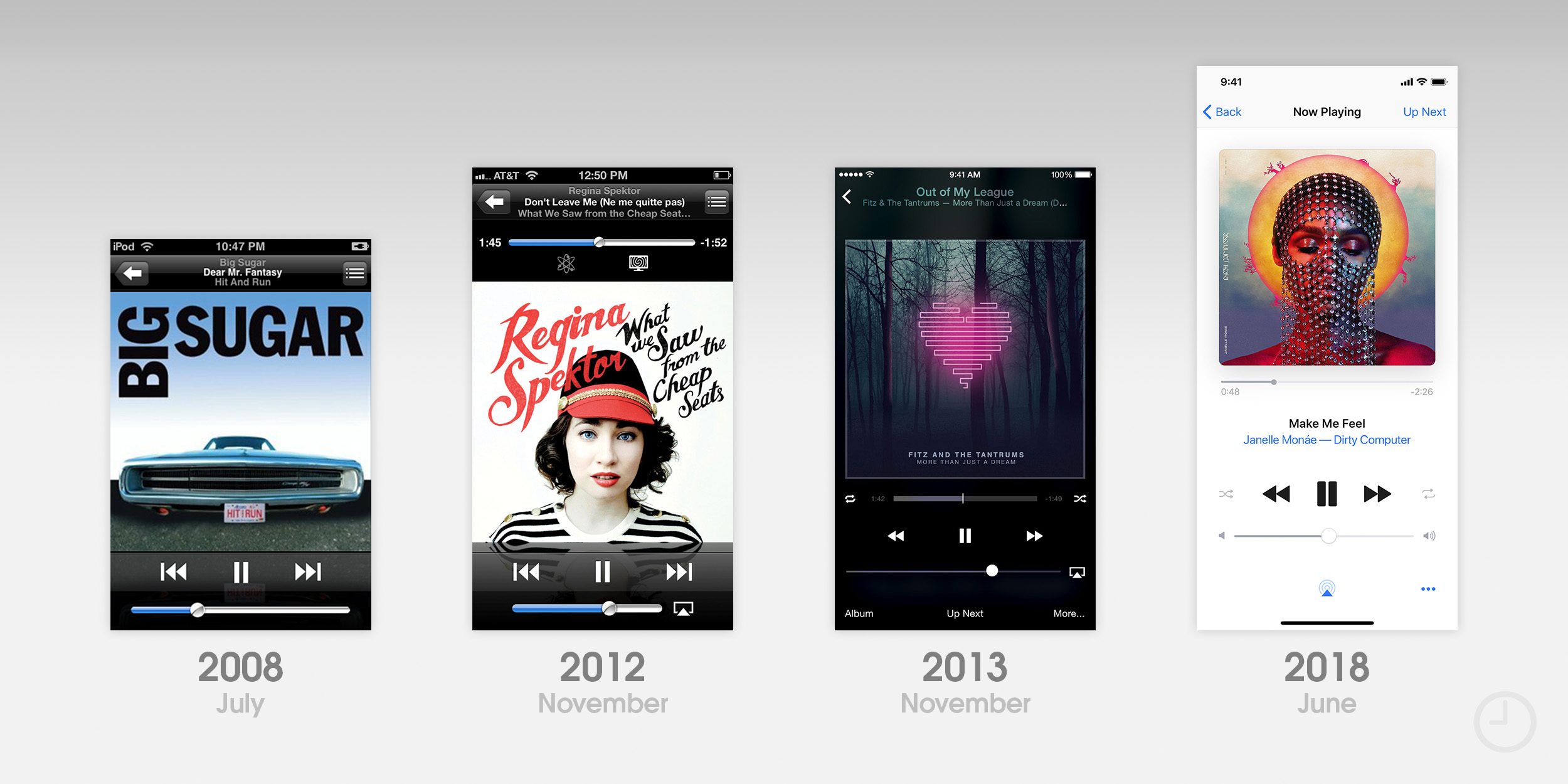
For the purpose of this piece, I've focused exclusively on notable visual changes to apps that were available to download on day one and are still receiving updates today. While many of these apps are also available for iPad.

The Icons
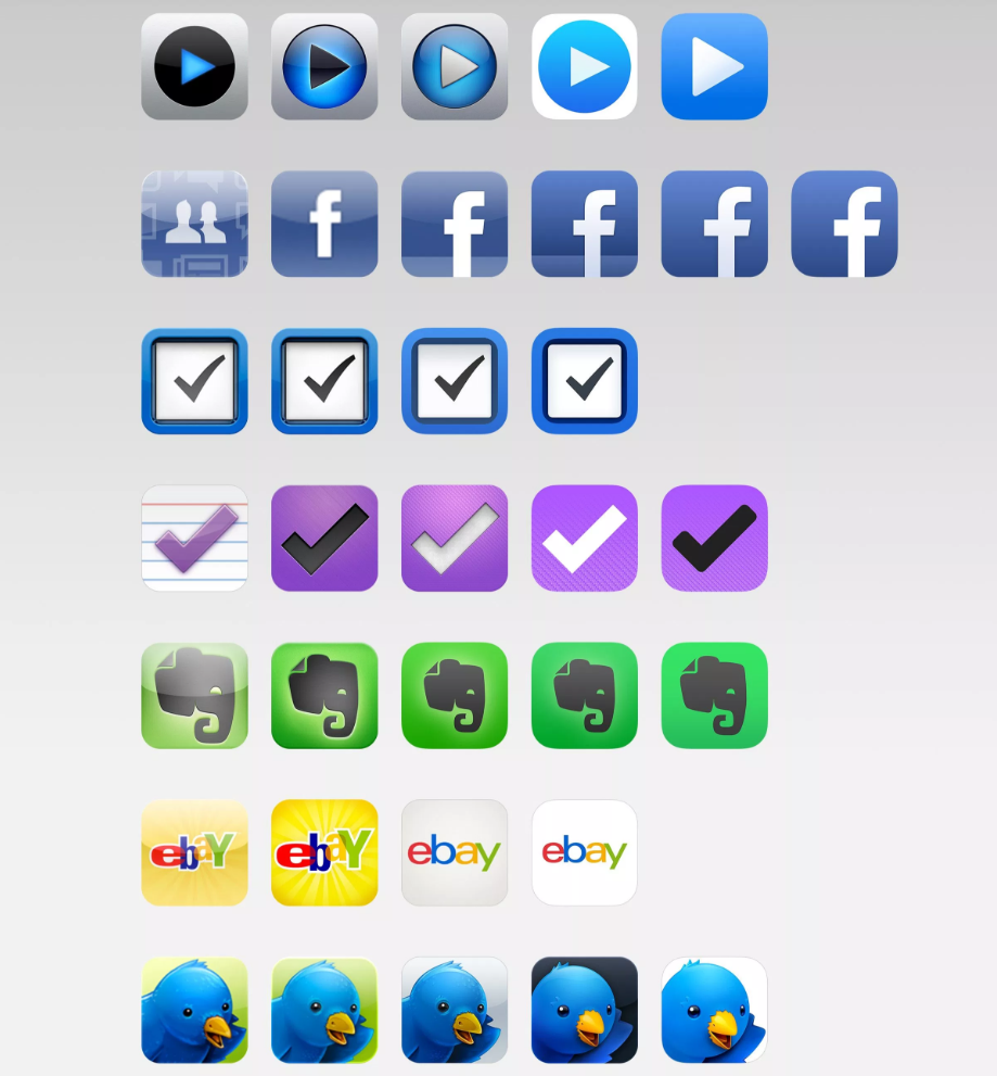
Comparing the icon iterations of all ten highlighted apps side-by-side reveals the unique path to modernity each chose. Some icons have remained fairly consistent over the past decade with only minor refinements, and others have been redesigned every few years. Lined up chronologically, industry-wide design trends become obvious.
Across the board, glossy icons ruled the land when the App Store launched. Icon gloss was applied by default, and developers had to specifically disable the effect in Xcode to remove it. As iOS apps matured, most eventually lost their gloss and adopted highly detailed custom designs.
iOS 7 famously reset the metric for what makes a good icon. Highly textured and 3D rendered assets generally looked out of place alongside Apple’s new icon set, and some clashed with the updated rounded corner radius. As designers and developers gradually established new guidelines and best practices for icon design, detail and more restrained color palettes have crept their way back into many icons.
The Next 10 Years
In 2008, it was impossible to accurately predict how the App Store would evolve. Innovation sprang from innovation, and the tastes and habits of iPhone owners shaped the kinds of apps developers chose to make. The same can be said going forward. Upcoming iPhones and versions of iOS will surely change the app landscape in unforeseen ways. A new design trend could sweep the globe tomorrow. Even after 10 years, the future is exciting.
Source: 9to5mac